Creating game videos: best practices and pitfalls to avoid
Alconost's Natalia Shuhman shares her experience in game trailer and teaser production
Alconost is a localization company, but we also create videos for games.
We've been creating game videos since 2013, and in that time we've amassed considerable production experience that I think you'll find useful. In this demo reel you can see what our experience is based on.
Videos vary considerably. But to produce any video, be it a trailer for a marketplace or a teaser for an advertising campaign, we use the same video production workflow for each project. You can easily follow the same process when creating a video on your own.
Our standard production pipeline is as follows:
Today I'm going to guide you through this process and give you some practical tips on how to end up with a game video that you can be proud of.
The brief: prioritize game features from square one
Everything starts with a short questionnaire that determines the framework. Our brief contains 12 questions, but I'd like to highlight four of them. What you decide here will influence the decisions you go on to make at subsequent production stages.
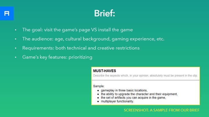
- Select your goal: visit the game's page vs. install the game
First, ask yourself: is your video intended to bring the users to the game's page? Or is its goal to convert game page visitors into users? When you know the goal, and understand the context in which users will be watching your video, it will be easier for you to develop your ideas.
- Select the audience: age, knowledge, cultural background, gaming experience, etc.
Next, think about your video's intended audience. Their perception, their red lines, and whether they will understand the idea you wish to convey depends on factors like their cultural background, gaming experience, etc. This can affect your creative decisions regarding the concept and style of your video.
- Requirements: technical and creative restrictions
Your decisions may also be influenced by the rules of the platforms where you are going to place your video. For example, if you need a video for the App Store, its duration must be from 15 to 30 seconds -- no more, no less.
Moreover, to meet the App Store's recommendations you need to focus more on showing actual gameplay than on telling your game's universe story. So give the platform's guidelines a close read to avoid having to redo your video significantly.
- Prioritize your game's key features
Finally, keeping in mind all of the above, prioritize your game's key features. For example, if your target audience is users who are not overly experienced in gaming, it might be a good idea to focus more on basic functions than, say, to delve deep into combat tactics or other features that advanced players would appreciate.
In the screenshot below, you can see an example of how the prioritized list could look.
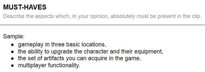
Of course, prioritizing isn't as simple as it seems, because you're a developer: each feature is like a child of yours, and it's hard to choose what to omit. But this is an essential step in order to emphasize the features that have the best chances of grabbing your audience's interest.
Once the framework has taken shape, it's time to start thinking over the script.
Script: think of the scene's function, the action in the frame, and the voiceover text simultaneously
Scriptwriting is an exciting process, but this excitement can cause you to lose focus. When your thoughts are scattered, a comprehensive approach can help.
Let's have a look at the sample in another screenshot below.
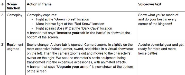
This is a sample script structure that shows how each scene has its own function -- for example, to elaborate on a specific game feature. And this function should be emphasized by more than just the visuals -- the calls to action on the banners and the voiceover text should tell the same story, so that everything in the scene is connected.
To make it even easier for your audience to follow your thoughts, try to stick to the "one feature, one scene" principle. This will help keep the narrative clear, avoid overloading, and transition smoothly from one feature to the next.
To make it even easier for your audience to follow your thoughts, try to stick to the 'one feature, one scene' principle
Although working on scripts is riveting and absorbing, it's crucial to remember what can affect the production in your particular circumstances. You may have a tight budget, limited manpower, a deadline, or all of the above.
So when thinking over the visual part of your video, ask yourself: what assets will comprise each scene? Would just actual gameplay footage be enough to demonstrate a specific feature? And if not, do you have the resources for a more complex demo of this feature? Give this question at least preliminary consideration. If you make a mistake, it will come out at the storyboarding stage.
Storyboarding: arrange your assets wisely
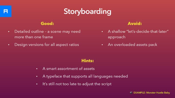
When developing a storyboard, remember that for some scenes you may need to design multiple stages. For scenes where gameplay capture is supposed to be shown, consider recording the gameplay at this stage, reviewing the captures, and making sure that they fully convey the idea of the scene.
If the capture doesn't work as well as you thought, there are at least three options to avoid disaster. First, you can always come back to the script and revise it.
Another, arguably better, option is to allocate resources for building the scene in the game engine, make all the necessary adjustments, and record the gameplay not from the build but from the engine. One more option is to show the feature using animated graphics, be it new art that you design specifically for the video or preexisting game assets.
If you need a video in different aspect ratios, storyboarding for these extra versions isn't a must, but it may still be something to consider. For instance, a given scene may not be understandable in a vertical version due to cropping. And you can conserve resources if you allow for variations in advance.
If you need a video in different aspect ratios, storyboarding for these extra versions isn't a must, but it may still be something to consider
To simplify things for your production team, organize all your visual assets wisely. Select only the art that is necessary, and make this collection of assets easy to navigate.
Let's look at an example of a video that required really well-planned storyboarding. It consists of scenes with animated graphics. And arranging all the art at the storyboarding stage was a good way to simplify the animation stage. Check out this teaser for the game Monster Hustle.
If the video you need for your game is along these lines, it may turn out that certain essential visual details do not yet exist in your assets, in which case you may need to draw them specially for the video.
When you are all set with the storyboard, it's time to proceed... not to the animation just yet, but to the background music and voiceover track.
Music, voiceover, and why they go before animation
Let's start with the music. The best solution is to select the background track before you start working on the animation. This will allow you to set your animation "dancing" to the tempo of the music, so that the audio and video sequences echo each other. This makes the watching experience more immersive and enjoyable.
Remember that you don't have to stick to the in-game music. For instance, the ambient music from locations may prove too monotonous and unsuited to the dramatic structure or emotional load of your video. The solution is to either browse royalty-free markets or, if you work with a composer for your project, get them to write a custom musical theme for your video.
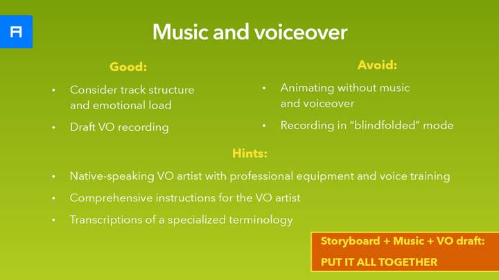
For voiceover, before you record the text with a native-speaking professional, record the voiceover on your own and try combining this draft narration with the storyboard and the music. This way you'll be able to double check whether the voice and the picture support each other semantically and tell the same story. If you notice any deficiencies, at this stage it's quite easy to correct them.
Next, once you've made sure that the voiceover text is flawless, provide a professional voiceover artist not only with the text to be read aloud, but also with the storyboard, music, and specific instructions. For instance, elaborate on what kind of a storyteller you want them to impersonate: describe the desired manner of speaking, voice tone, and pace.
Last but not least, explain to them how your characters' names or even the game's title should be pronounced, including stresses. It may seem a small thing, but it really matters.
Once the music has been selected and the professional voiceover has been recorded, it's time to move on to the animation stage.
Animating to the beat of the music
This is the stage where you focus on motion design. To simplify and speed up the production process, try assembling the video scene by scene. Animate one or two scenes and evaluate the intermediate result.
Remember that your team may have something to say as well. If you encounter mutually exclusive ideas, your task will be to reconcile the different points of view, structure your team's comments, and provide a motion designer with consistent and coherent feedback.
Remember that you need more than nice-looking animation: you need an attention-grabbing video
When evaluating the intermediate result, remember that you need more than nice-looking animation -- you need an attention-grabbing video. For this purpose, focus on how the viewer's attention is being controlled. For instance, you can:
- Zoom in
- Make the camera follow a key moving object
- Highlight this object
- Magnify it
- Add an animated pointer
This is not an exhaustive list. Tricks like these make the video easy to watch, which is something that doesn't just happen on its own: it has to be embedded into the animation.
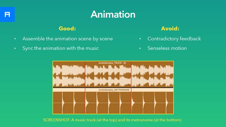
What should also be embedded is synchronization of the motion to the beat of the background music. To achieve this, create a metronome that will follow the tempo of the music and try showing key animated actions on the stressed beats.
Have a look at the example below. In the screenshot, you can see that the stressed beats of the metronome correspond to the beat of the track. Believe it or not, a simple thing like that can work really well as a skeleton for the animation.
Of course, there are many more details that can make the animation really terrific or, conversely, spoil the impression. But careful execution isn't the only key to perfection. Consider the animation not simply as an embellishment, but as a means of transmitting ideas. Make your animation meaningful. Try to make the motion convey emotion. When the right ideas and the right emotions meet, the result is magic.
When the animation is ready, it's time for the final stage: sound design.
Sound design and a convincing reason not to skimp on it
At this stage you may need to cut the music track to match the duration of the animation, and to match particular parts of the music to particular events in the video sequence.
Using sound effects you'll be able to enhance specific emotions, be it excitement, suspense, or even fear. Actions such as scene changes, tagline fly-in, or the game logo's appearance can also be emphasized with sound effects. But don't go overboard. Use sound effects wisely, emphasizing only what needs to be emphasized.
There is one factor that may discourage you from investing in sound design for your video. The fact is, one to two thirds of users watch their videos muted. The game video creator's job is to make the video ideal for both those who watch the video with sound and without. In the long run, since sound design won't cost you an arm and a leg, it makes little sense to skimp on it.
As an argument in favor of giving attention to sound design, you can check out this video created for the game Infinitode 2, where the music and sounds are essential components.
Pitfalls & snags: 12 mistakes to avoid
Sometimes it's not easy to tear a video to pieces in search of the secret ingredient that makes it cool. Usually it's a combination of a well thought-out concept and flawless execution. However, if I had to rate the most common mistakes in game video production, I would mention these twelve points (see image below).
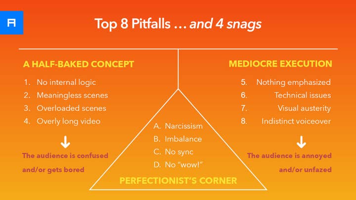
Those listed on the left have their roots in the conceptual part. It's all about loose ends at the briefing and scriptwriting stages.
Others, listed on the right, are the result of imperfect production, like the absence of visual accents, camera shake, pixelization, and so on.
Lastly, the ones listed in the triangle in the middle are not deal breakers, but without them the video would have a more polished look. These include undue screen time for the game's title or the studio logo at the beginning of the video, scene duration imbalance, and imprecise synchronization of the animation with the music.
On top of that, sometimes you wince at missed opportunities to send shivers down a viewer's spine. Together, all these drawbacks sometimes just... don't let the magic happen.
How not to fall into these traps? Of course, there's no silver bullet, but let me give you a piece of advice: try to put yourself in the potential player's shoes. Imagine the context in which your videos will be shown, and imagine that you need to explain your game to a person who knows nothing about it, and maybe has never played any game like this before. Help that person: motivate them to give your game a try.
Natalia Shuhman is an information and communications specialist with a master's degree in sociology. Working for Alconost, she has been writing scripts for videos about games and software products. Alconost localizes games into more than 70 languages and creates videos for games in any language.
