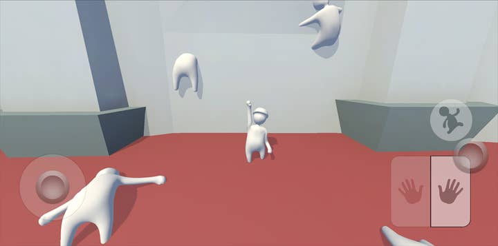
The challenges of porting Human: Fall Flat to mobile
From touch controls to performance optimization, Codeglue details the complexity of bringing No Brakes Games' hit to mobile
We are Codeglue, a company that worked on the mobile port of Human: Fall Flat. Our main job on this project was to ensure that everything from menus to gameplay felt as good and mobile-friendly as possible, while keeping support for bluetooth controllers. In this post we will show how we tackled the challenges we faced.
Human: Fall Flat is a physics-based puzzle platformer published by 505 Games where you run, jump, lift, climb and fall your way through levels.
First, we will go over the challenges we faced with implementing touch controls for this PC title, discussing how we came up with a new control system. Then we will show which steps we took to optimize such a physics-heavy game on mobile phones.
Implementing touch controls
In Human: Fall Flat the player controls a third person avatar that can run, jump and grab stuff. This grabbing behaviour is split into two parts: the left arm and the right arm, allowing the player to control with which arm they want to grab hold of things.
The grabbing mechanic proved to be quite the challenge to translate to touch and make it feel natural and intuitive
On consoles, this behaviour is linked to the controller triggers, pressing a trigger raises the corresponding arm. The arm height is controlled by the camera angle, so looking up raises the arms in the sky, and looking down has the player grabbing the floor.
The issue we faced with the grabbing mechanic was two-pronged:
- How does the player accurately control either arm, and sometimes both?
- How does the player aim the arms in a natural way on a touch screen?
This grabbing mechanic proved to be quite the challenge to translate to touch and make it feel natural and intuitive. Because it's the core mechanic of the game, we spend quite some time on iterating and polishing the mechanic to make it feel as good as it can be!
- Toggle the arms
We started with coming up with a good way for the player to decide which arm they wanted to activate. With player movement taking up the left section of the screen, we decided to place the arm interactions on the right side. Our first iteration was to take a button and cut it in half, allowing the player to toggle which arm they want active, or both.
The player could play the game with these controls, but a lot of mental energy was required to keep track of which toggle was active
This played okay-ish, but not great. The player could play the game with these controls, but a lot of mental energy was required to keep track of which toggle was active, and turn them on and off.
Our next step was to add some supporting controls to this system by allowing the player to disable all active arms by tapping anywhere on the screen, as players often need to grab and release stuff.
This improved the experience quite a bit, but also highlighted the main problem with the grab mechanic: the camera.
- Camera troubles
Controlling the arm height through the camera was just not really working for us on mobile. The camera is controlled by sliding anywhere on the screen and worked fine for looking around and adjusting the camera every now and again, but aiming the arms required the player to adjust the camera way more than desired.
Our solution was to decouple the camera from the arms, to allow the player to aim each component separately, but that means we need a new way to control the arms. We decided on a joystick approach for the arms, keeping much of the toggle functionality, but take the vertical axis into account.
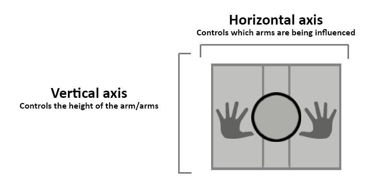
With this approach the player can move the knob around to gain the result they want. Moving the knob on the horizontal axis controls which arm (or both) are active, and the vertical axis controls the height of the arms. Holding the knob still for 0.5 seconds locks the arms into place, allowing the player to safely let go of the knob without fear of letting go.
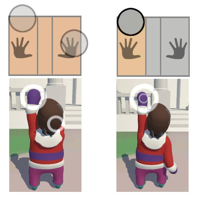
This frees up the camera and makes the overall viewing experience a lot calmer as well, as the player is no longer jamming the camera into the floor in order to reach for high places.
- Final result
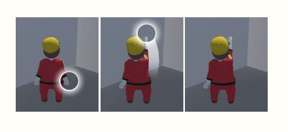
In the end we shipped with one additional control scheme, allowing players to directly touch and drag the arms as well as using the right side 'armstick' as described above.
Players can grab either arm, or both if they touch and drag the character itself and just move them around intuitively. The player can also tap on a raised arm to release them, allowing for very direct feedback and control.
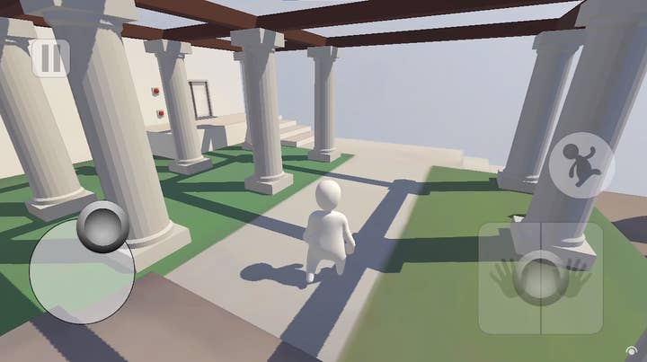
These two control schemes are both active at the same time, so players are free to pick and choose between the two, making the overall control system available to the player very diverse and intuitive. We also cleaned up the UI art to match the Human: Fall Flat style and that is what we ended up shipping.
Performance optimization
The game controls work well on mobile now, but we still had to make sure the game actually ran at a decent framerate as well, with the playable levels becoming more and more intricate, the further you progress. We had to make sure the performance would stay optimal for a fun experience.
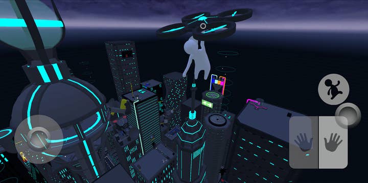
Physics calculations are expensive and when paired with big open level scenery, low framerate becomes a valid concern. We'd like to take you through a few of the steps we took to make this game run buttery smooth on even some low-end mobile phones.
- Physics optimization
The player character consists of many physics driven body parts which are -- often in hilarious fashion -- constantly colliding with the level and other objects. How the player character reacts when he falls and flops against the terrain gets determined in complex physics calculations. In order to save some much needed processing power, we had to make these calculations both easier and less frequent.
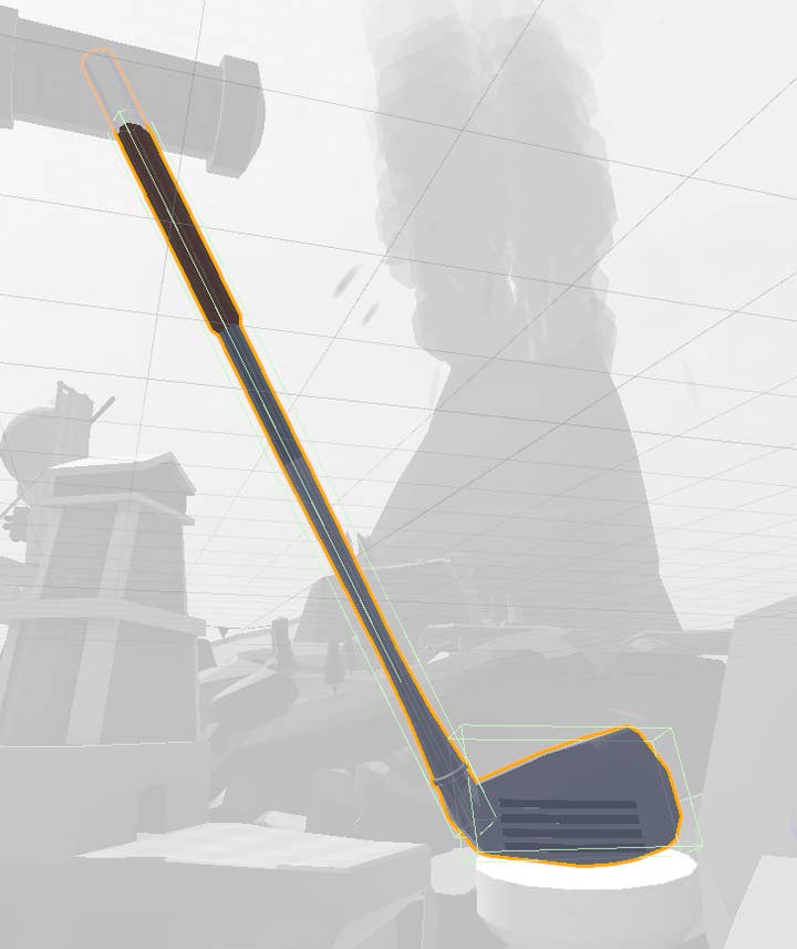
Many of the level's objects had their colliders altered. A collider is the shape that the 'physics world' sees the object in, regardless of the visual shape the player sees. This means that the physics interactions can be calculated for a much simpler representation of the object's actual shape. Great! That happens to be exactly what will make the physics calculations a lot easier for the hard-working mobile devices.
A small golf club composed of a grip, shaft and head gets represented by something less complicated -- a stick. A bigger golf club? A bigger stick!
The big golf club has an added box at the end to more closely represent the club head, but these primitive shapes are still much more performant in calculations than its complex visual shape. On top of that we decreased the amount of times these calculations get performed from 60 times per second to 45 times per second. Less calculations, means more juice to do other demanding tasks such as the visuals!
- Optimizing lighting
We didn't want the visual appeal of the game to suffer noticeably with the change from desktops to mobile phones. However, changes needed to be made to certain aspects of the visuals to let the tiny computers keep up. A very performance-intensive issue we needed to tackle first was lighting. Lighting is what breathes life into a scene, but doing so during runtime is also one of the most taxing processes.
Dynamic lighting will process all the sources of light in a level and display their effect on their surrounding every frame. This results in lights blending together, combining colours, and making shadows warp perspective as you make your way past different scenes in the level.
Sadly, this was just too demanding for the poor handhelds to perform. We tried to approach the lighting found in the original PC version of the game by baking most of the lights onto the geometry.
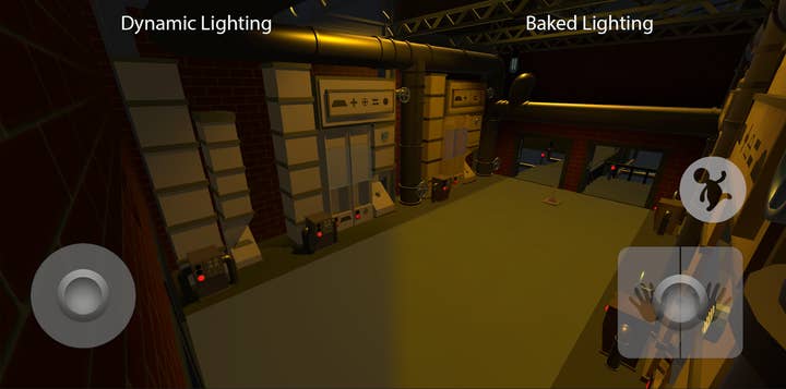
This means that those light sources calculate their purpose during the build process of the game, rather than during gameplay, which then gets saved into the level. Playing through the level you will still see all the lights cast their shadows on the level geometry itself, but the moveable objects such as player characters and other interactable objects cast a more simplistic, directional shadow.
- Tweaking the level of detail
Besides lighting we also applied slightly more restrictive LODs on many objects. LOD is the abbreviation of 'Levels Of Detail' -- they are used to simplify the quality of an object's visuals when the camera gets far away. This is incredibly helpful in reducing the power it takes to render complex objects.
A beautiful minecart should obviously look like minecart up close, but when its size on the screen isn't bigger than the head of a pin, we can simply represent it with a grey box instead. You won't even notice the difference.
We're proud of the product we're delivering, and bringing the Human: Fall Flat experience to mobile users across the world. With every new, increasingly complex level that gets added to the mobile version of Human: Fall Flat, we keep facing new challenges we must conquer in order to give the players a smooth experience.
Jori Kamp has been working at Codeglue since the end of 2018 and has worked as a game designer on Human: Fall Flat. Jorick de Hoog has officially been working for Codeglue since early 2021 and is currently working on updates for Human: Fall Flat. The mobile version of Human: Fall Flat was published by 505 Games.
