Phones within phones: Simulating real apps to explore real issues
Lost Phone and Bury Me, My Love developers discuss the intimate impact of games that behave like mobile interfaces
While many developers endeavor to push the limits of how 'real' they can make game mechanics feel, mobile games are in a unique position.
Multiple successful mobile games have dabbled with the premise of the player interacting with their phone as if it were exactly that: a phone, theirs or someone else's. This particular kind of interaction has its own challenges, but can also foster greater intimacy between the player and the game's characters they 'communicate' with.
To learn more about this, I spoke with programmer Diane Landais and artist Miryam Houali, co-founders of Accidental Queens, about their games A Normal Lost Phone and Another Lost Phone: Laura's Story. I also spoke to Florent Maurin, CEO of Pixel Hunt, about Bury Me, My Love. Though both games are radically different in their stories, genres, and gameplay, they have one thing in common: they both use the platform of a player's mobile phone as a mobile phone. That design choice made from some interesting similarities between the two, as well as some stark differences in approach.
"They were discussing very trivial questions and making jokes and sending images and selfies but also, five messages later, they were discussing matters of life and death."
For example, both Accidental Queens and Pixel Hunt conceived their games in a similar fashion. Each team was inspired by other games that used similar mechanics, and later on found an important topic that could be explored through that mechanic. Landais conceived A Normal Lost Phone at a game jam with other members of what would become Accidental Queens, though the basic concepts had already begun to form in her mind.
"Using real-life devices as mediums for storytelling was something that I wanted to explore," Landais said. "I had played some games that did that really well. One of them was Cibele, by Nina Freeman. Another was Analogue: A Hate Story by Christine Love. Incidentally, the real starting point was that someone on the team wanted to go to a party on the second day of the jam, and proposed that we could take pictures and videos during the party and use that to tell a story and have an investigation of what happened at the party only from that point of view.
"From that we talked about our different inspirations, and that's when I wrote down my idea of a phone game and that's when Elizabeth [Maler] wrote her idea of specific topics the game could tackle: tolerance and trans identity. Those things mashed up pretty well in the 48-hour time frame we had for a jam. We never went to the actual party."

Maurin, meanwhile, was inspired by Lifeline, but wasn't into sci-fi. The idea for a game set in a messager app percolated until he encountered an article in Le Monde that chronicled the journey of Dana, a Syrian woman who kept in touch with her family through WhatsApp as she fled Damascus to Germany. The article, which was presented as an actual WhatsApp conversation, fascinated Maurin.
"I immediately felt connected to those Syrian migrants," Maurin said. "They were discussing very trivial questions and making jokes and sending images and selfies but also, five messages later, they were discussing matters of life and death. And this is something I don't do, obviously.
"So it made me think about the relationship we have with our phones, and how it's important for everyone on earth to keep in touch with their relatives and loved ones, but how it takes a completely different meaning when you're a migrant and you're trying to find some place to live because the place where you used to live is too dangerous. So that's why I decided to make a game about Dana and her story and the thousands of other stories I've heard about in the news."
Unsurprisingly, both development teams found the structure of an actual phone helpful in establishing a personal connection with players. But they approached it in different ways. In the Lost Phone games, the player plays as themselves finding a missing phone that belongs to someone else. They then must delve into that person's phone (and effectively their life), learning enough about them to eventually (hopefully) make the decision of what to do with the phone that the main character would want.
"All my life is in my phone. I have pictures of my children. I have messages I send to my loved ones. I have all my contacts, all my informations, my agenda, my bank account, all my life basically is in my smartphone."
To do that, Landais and the team had to make sure the character to whom the phone belonged was very, very believable.
"If you took my phone right now you'd see different conversations with my parents and my friends or whatever. I don't speak the same way with my parents as I do with my friends, for example. In A Normal Lost Phone, the father always ends his messages with '-Dad.' That's something many dads do. And that's something many players at least laughed at, but some of them actually said, 'Yeah, that could be my father.'
"And that's what we wanted to do, make it personal, make it realistic in a way. Because the topics in the game are important and humane, and it was important to accurately balance between something that is real and something that is constructed. Being in a kind of blurry space in between helped us in a way to deliver a very specific message."
As far as the topic of a phone being a perfect avenue to convey intimacy, Maurin agrees. "The relationship we have with our phones nowadays is super intimate. All my life is in my phone. I have pictures of my children. I have messages I send to my loved ones. I have all my contacts, all my informations, my agenda, my bank account - all my life basically is in my smartphone. So immediately when you have your smartphone in your hands, you are in this special mindset. There's this special relationship you have with this little piece of technology that is always with you, it's the first thing you look at in the morning and the last thing before you go to bed. So if you want to tell a very intimate story, and that's definitely what we wanted to do with Bury Me, My Love, then using a device that is already intimate for you as a player is something that is efficient.

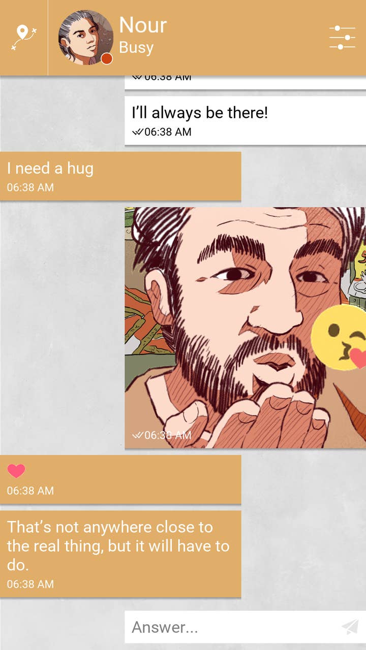
But unlike in the Lost Phone games, in Bury Me, My Love, the player is merely along for the ride with Majd as he speaks to Nour. Maurin has always been very careful about making the distinction between Majd and the player.
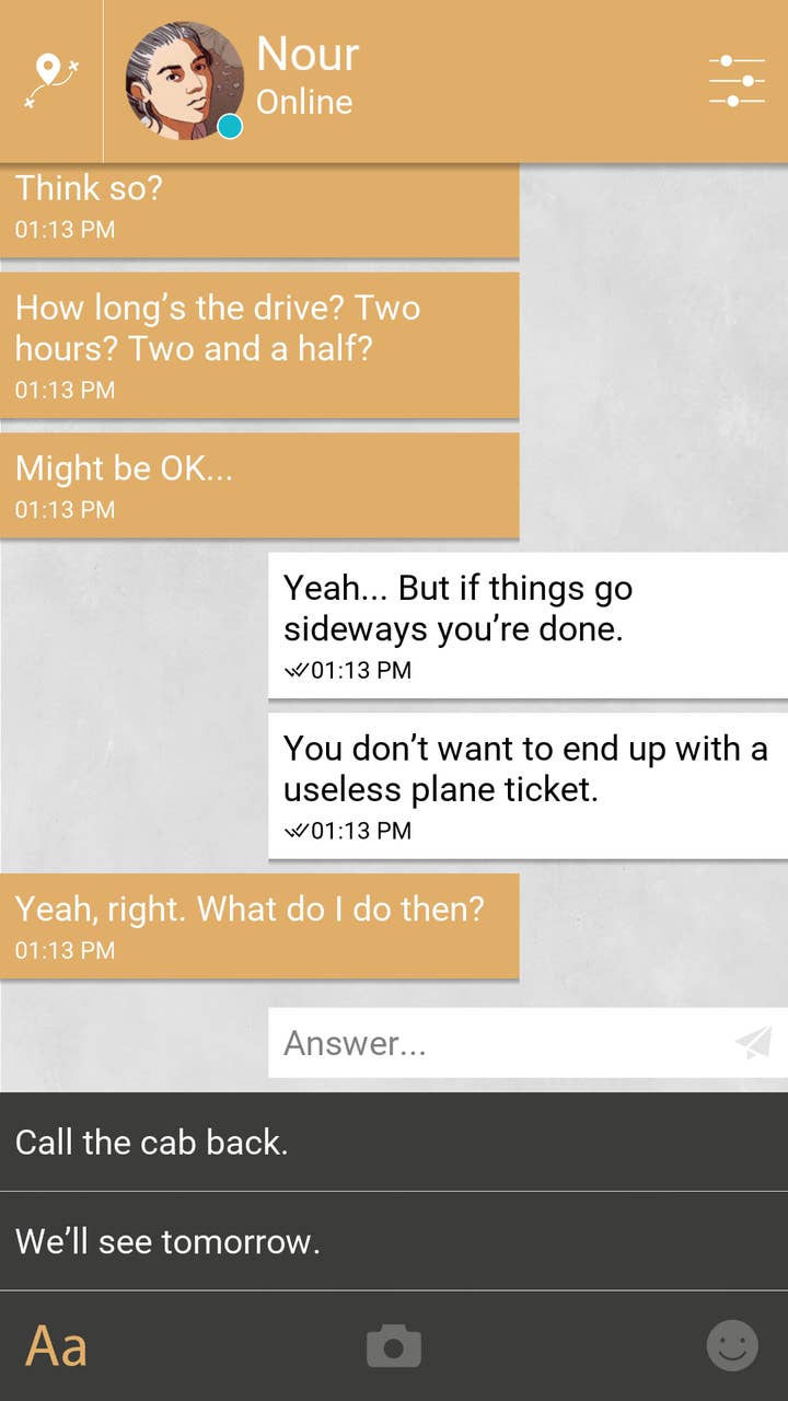
"What we as a team wanted to make is to make a game that for once would not be about the player," Maurin said. "It led us to make some very stupid game design decisions. For instance, there are moments in the game where you have to give Nour advice and you absolutely do not have any idea why you would say something over something else. And this is unfair and this is something that every game design teacher would strongly advise against because one of the pleasures of games is mastering the causes and consequences of the actions you can take in the game.
"But in our particular situation, we wanted you to have to make blindfolded decisions and to have to face potentially completely unfair consequences. And we also wanted you to not be the person you were supposed to be. Majd is a character on his own; he has his own personality. More often than not he says things that I would not personally say. But it's because we really wanted to make this story about them and not you as a player, and we wanted you to experience this helplessness and this feeling of life being unfair and your decisions not mattering enough.
"Even though you really want to save Nour because you care about her, this game is about coming to terms with the idea that there are situations in life where you cannot help the people you love. And that's probably one of the most difficult things you have to face in life."
Although a feeling of intimacy proved a boon in getting the message across, it occasionally proved an obstacle for Landais as well. Once the game progressed beyond the original game jam setting, playtesting revealed that the level of intimacy made some players feel uncomfortable 'snooping' through someone else's phone. This led to some design decisions meant to distance the player just enough to keep them interested without feeling guilty.

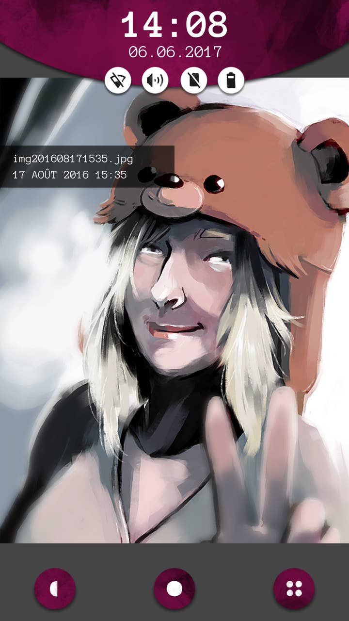
One example of this occurred with character portraits and photos. For the game jam, the team had used drawn pictures for these elements, but later they considered actual photos. The idea was quickly nixed. "From the feedback that we had, it was clear that it was already uncomfortable enough to snoop through the phone and having real pictures of real people would make it even more creepy; too creepy," Landais said.
Player feedback was also critical when deciding to port the game to desktop or the Nintendo Switch. Though looking at a phone interface on a device that isn't a phone may not be the ideal way to play the game, Landais was confident in the ability of players to accept something just a bit strange.
"It does lose something on desktop versions," she said. "I think the Switch version is perhaps more similar to the phone because there is a touch screen, and if you remove the Joy-Cons, the Switch is like a fat mobile phone or tablet. I think players are used to accepting things like, 'I'm not holding a phone, but everything tells me that this is a phone and I can believe that.' And it's not something that's conscious, even."
In the case of Bury Me, My Love, Maurin thinks game works far better on mobile, but large contingent of interested fans wanted to play on PC and refused to play on mobile, so he's proceeding with the PC version despite his own restlessness to move to a new project. The PC version plays all at once, while the mobile version features pauses of minutes or hours where you don't hear from Nour and must wait for news.
"What happens when suddenly the connection drops and you don't have any news from them for two, three, four days?"
For Maurin, losing that pause time hurts the game's impact. "People who are related to migrants say that biggest thing in an era where everyone is connected all the time is when you cannot reach someone that you know you should be able to reach. What happens when suddenly the connection drops and you don't have any news from them for two, three, four days? This is the most agonizing, most complicated thing to deal with. This is why I think that the wait times in Bury Me, My Love are so important to what we tried to convey with our game. If you lose that in the desktop version, you lose something that wa important to us because we wanted to reflect all the documentation we gathered and all the things people who actually lived through the situation told us.
"But I think you have something else with the desktop version, that you are in the journey, in the moment, and keep moving forward and forward. You get this feeling of running away from danger into danger, and that is also something interesting. So I don't hate this desktop version, it's just not the way it was designed to begin with."
Wait times are an interesting design element that deepens the believability of a game taking place on a phone, but both developers had to be careful not to overdo such elements. Maurin was cautious to effectively centralize Bury Me, My Love around a single messenger mechanic with little else to keep the focus on the story.
"We thought about checking your phone's clock and trying to somehow synchronize Nour's messages with the actual time of the day that you were in," Maurin said. "If it was 9 a.m. for you, then she will send you messages where it's also 9 a.m. somehow for her. But it felt forced, you know? We didn't think it'd be worth the mind-twisting just to have a clever feature, so we tried to keep it as straightforward as possible. So there are images, there are selfies, there are notifications, there are of course text messages, and that's about it. That's all we needed to tell the story we wanted to tell, so we stopped there."

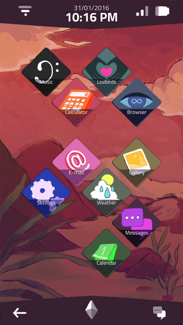
Meanwhile, Accidental Queens felt the opposite way. Since the player would be interacting with someone else's entire phone, a wide variety of apps would need to be available to make everything believable. During the initial development, the team made lists of every app that was on all of their phones, but also several apps that were only on one person on the team's phone, since most people will have a mix of common and more personal apps.
Of course, if an app was on the phone, it had to be usable, or there had to be a good reason why it wasn't. As Houali put it, "You can't call people with the phone in A Normal Lost Phone, because that would obviously be too tricky to code or design. There is a button to do that, but it just says you're out of credits, or the sim card is broken. If we just removed the button, it wouldn't have been as believable as a user interface for the players."
Landais added, "It's all about maintaining the suspension of disbelief but not pushing it too far. If you have a messaging app on a phone, you expect to be able to call the contacts, otherwise it's not my phone's contact app. It's weird. There are many small details in both games where we had to ask ourselves the question, 'How do we disable it in a way that makes sense?'"
In making the Lost Phone games, Landais, Houali and the team learned a lot about translating real interfaces into game mechanics, and how playing on the way people communicate could be used to deliver a specific message.
Landais concluded, "It's super interesting to realize that everything that we do in our day-to-day life has an impact not only on us, but also on the others around us, like the way we communicate and how we leave traces of what we do, especially in the digital environment. This applies not only to phones, but to everything. All of this has meaning and an impact, and it can be measured and can be thought about and should be and it also makes for some pretty good game mechanics."
