Insights into adaptation game design challenges
Sponsored article: Abstraction goes through the tailoring pillars that shape its adaptation design approach for the GamesIndustry.biz Academy
Tailoring (verb): The process of adapting a game user experience and user interface to a new platform.
Let's talk about the design side of Abstraction.
Over the last 12 years, Abstraction has been in the business of porting, co-development and multiplatform development. We worked on 15 different platforms and delivered over 160 SKUs, spanning over a broad spectrum of video game genres from point-and-click adventure, to strategy or survival games.
Tailoring, or adaptation design at Abstraction, is guided by the following principles:
- Mastering the platform specific user paradigm
- Understanding the player's User Experience (UX from now on)
- Adapting and enhancing the game UX on any new platform
"Our tailoring designers develop extensive platform user paradigm knowledge and intimate understanding of the general UX principles"
In our experience, these principles apply to any given game and platform adaptation project and, in a broader sense, hold true for any type of user-facing software on multiple platforms. We use this framework to define concrete goals for tailoring and set quality standards across any type of adaptation project.
Over the past decade we observed that new gaming platforms often introduce changes that either add something new to the user paradigm (i.e. Nintendo Switch with the mix of controller and tablet touch controls) or improve the existing paradigm to better structure the UX (i.e. the evolution of the rule set for user interface on Sony PlayStation).
To successfully adapt a game to other platforms, we consider it essential for our tailoring designers to develop extensive platform user paradigm knowledge and intimate understanding of the general UX principles.
The Pillars of Tailoring
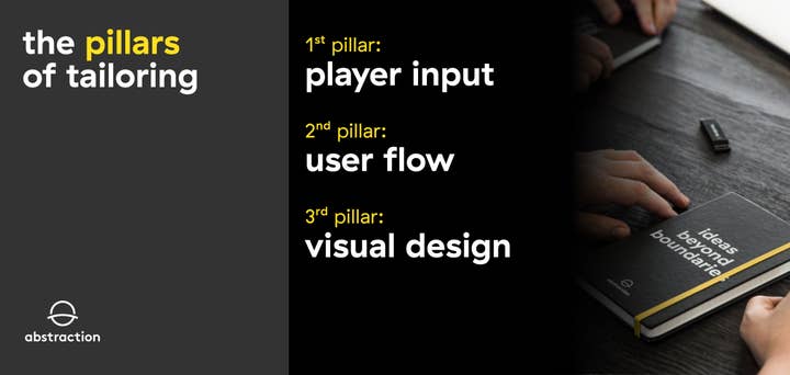
In practice, there are three tailoring pillars that shape our adaptation design approach: the player input deals with how controls are informed by specific platforms, the user flow focuses on overall use of the game interface and the UI visual design centers on functional aesthetics of the interface.
First Pillar: Player Input
Definition: the rule set for how players use platform peripherals to control the game.
We separate player input in several categories determined by gaming platforms:
- Mouse and keyboard (PC/Mac)
- Controller (PlayStation/Xbox)
- Touch (iOS/Android)
- Hybrid controller and touch (Nintendo Switch)
Each category of player input comes with its own set of rules and conventions. There are various degrees of complexity when tailoring games from one platform to another. In our experience, tailoring games to and from mobile platforms is the most involved process, practically requiring full reconceptualization of the player input approach, with significant design changes and additions. At the other end of the spectrum, tailoring from console to console is often a simpler endeavor.
It is worth mentioning that it may be easy to assume PC is a more forgiving target platform, but we found out that is generally not the case.
This fundamental understanding of platform specific paradigms is the first cornerstone of our tailoring design.
Challenge: The main challenge with player input is to find the best way of recreating the outcome of players input using a completely different device while preserving the nature of the game experience.
For example, one of the common issues in tailoring design is converting PC mouse and keyboard input into console controller input. That becomes particularly challenging when the original title relies extensively on affordances like keyboard shortcuts, mouse 'click and drag' functions or mouse cursor hover over for tooltips.
As we have discovered, the reverse can also be true when tailoring to PC games that have been purpose built for consoles.
- Abstraction War Story
A few years back, we worked on a project involving the adaptation of a console-exclusive fighting game from PS4 to PC, called The King of Fighters XIV, by SNK.
"Never assume tailoring is less challenging just because the target platform is less restrictive"
While initially we felt confident that tailoring would be a relatively straight forward effort, because of the target platform being pretty forgiving and less restrictive on resources, we encountered an unexpected challenge: our client desired to support an extensive range of controllers compatible with PC, ranging from professional fight sticks to generic fight pads, in addition to mouse and keyboard.
Apart from the implicit technical challenge, this required extensive research into types of PC-compatible controllers, fight sticks and fight pads. Luckily, one of our programmers was an avid fighting games player and helped with narrowing down the list to the most established types of devices in common use within the community.
On the tailoring side, this meant a host of new tasks:
- Break down the controllers, fight sticks and fight pads into archetype classes
- Create a set of control input templates for each class of controller, fight stick and fight pad
- Redefine the system to automatically map the player input on the different types of controllers
- Redesign the controller configuration menu to display the different classes of input device
- Adjust the game session flow to correctly represent the input device for each player before a multiplayer match
We delivered on this task to the client's satisfaction and along the way learned to never assume tailoring is less challenging just because the target platform is less restrictive.
Second Pillar: User Flow
Definition: the user interface navigation, interaction and feedback rule set.
While game specific requirements inform the player input to a certain extent, they will predominantly determine the user flow. In this case it is much more difficult to define clear cut categories, but in our tailoring and adaptation work, we always consider the following:
- Game genre
- Single player vs. multiplayer modes
- In-game menu granularity
- In-world interaction complexity
Certain genres, like strategy or role-playing games, are menu heavy affairs that often include complex interaction flows. Others, like simulation or builder games, come with extensive in-world interactions that range from gamified* conventions to complex and intricate manipulation of in-game objects or environments.

A deep understanding of specific genres and their underlying mechanics and systems is the second cornerstone of our tailoring design.
Challenge: The main challenge with user flow is to find the best approach to facilitate players' interactions with the game UI and the game world.
It is worth noting that we sometimes encountered outliers like games in early access. Usually, early access games are still being developed and often come with incomplete UI or unpolished user flow, with existing features constantly changing, being removed or new ones being added. That had a significant impact on tailoring design work and affected both player input and user flow.
- Abstraction War Story
At some point in the recent past, we had an adaptation project for a popular PC-based survival multiplayer game, called ARK: Survival Evolved, by Studio Wildcard. The goal was to adapt it to consoles. But it came with a twist: the game was in early access. From a tailoring perspective, needless to say, it was a tough project.
Our client was aware of the unfinished state of the game and particularly of the state of the UI, but the development team was so busy with implementing new features, adding new content and fixing existing bugs, they simply did not have the time to work on the UI.
"One of the key challenges was to adapt the complex user flow for in-game menus"
Never shying away from a challenge, we undertook the task to do it.
The scale of work, even without considering the constantly evolving state of the game, was significant. This led to us assigning a dedicated team of two programmers, two artists and two designers whose purpose was to deliver a polished user interface that supported console controller input and worked consistently on both consoles and back to PC. Everything UI you see today in ARK is basically our design and implementation.
From a design tailoring perspective, one of the key challenges was to adapt the complex user flow for in-game menus. This complexity mainly came from interactions nested* within the inventory, equipment and crafting menus of the game.

Another significant challenge was that some of the interactions were contextually enabled or disabled. And to top it off, most of the menu interaction rules were exposed only via tooltips activated when the mouse cursor was hovering over an UI element. While on PC this feature is trivial, it is particularly difficult to deal with when players are limited to gamepads. On consoles this usually requires a complete rework of the layout to include dedicated info areas and extra button prompts for all possible contexts in addition to supporting tooltips.
To achieve our goal, we did a complete redesign of the user flow and optimized it for controller driven player input. Among other tasks, this entailed:
- Restructure the layout of in-game menus like player inventory, player stats, player equipment and crafting
- Redefine the flow of manipulating inventory objects
- Automate basic interactions to optimize required player input
- Minimize the level of nesting interactions
- Standardize the types of interactions like splitting inventory items stacks
"It is crucial that we make all the decisions related to player input, user flow and user interface visual style"
In addition to the complete overhaul of the user flow we also added a complete user interface visual facelift.
As a side note, our client for this project was initially interested only in us focusing on the technical aspect of porting the game to consoles. After earning their trust delivering good results faster than expected for the initial porting work, they decided to give us a shot at working on the game UI.
In the end, the updated interface we delivered was so well received by the community, our client decided to adopt it for all platforms.
The important lesson for us was that for a tailoring endeavor of such scope, it is crucial that we make all the decisions related to player input, user flow and user interface visual style.
Third Pillar: User Interface Visual Design
Definition: the art style, graphic design and layout of the UI.
The UI visual design is usually determined by the game's established art direction. For tailoring purposes, we break it down into several relevant components:
- Menu and HUD layouts
- Graphic design elements
- UI art style
In our experience with adaptation projects, we found that UI visual design is always necessary. Almost every tailoring project will require menu layout changes and our art team has been trained to seek out or create opportunities to improve the experience through discreet additions, like new visual effects that improve feedback, or stylistic additions that add an extra pinch of flair to the art style to better fit on the new platforms.
The ability to understand and adopt a given art direction is the third cornerstone of our tailoring design.
Challenge: The main challenge with UI visual design is to identify and deliver on opportunities that best support and enhance the player experience on the new platform.
Ultimately what you want is UI design that is so good, and so unobtrusive, that people don't even notice it's there. If players have nothing to say, you know you've done your job right.
- Abstraction War Story
One of the projects that stood out as a tailoring challenge a few years ago was adapting a classic PC adventure game to PlayStation 4, called Shadowgate 2014, by Zojoi. What made this project unique for us? The goal was to adapt a pure mouse-based point & click experience to one based on a gamepad controller where you wouldn't feel held back by awkward and slow controls.
The entire player input and user flow had to be overhauled to match the modern console user paradigm. This also required completely new HUD* and game menus art assets to support our gamepad control input.

Our solution for player point & click interactions: use a floating interaction wheel UI. We kept a virtual pointer driven by an analog stick, but the initial implementation was feeling a little rough.
To smoothen the input, we implemented pointer movement inertia. While this felt better, it still wasn't as good as we wanted it. So, taking advantage of the 2D environments of each scene, we also implemented scene background movement opposite to pointer movement input to create a perception of movement acceleration.
"What you want is UI design that is so good, and so unobtrusive, that people don't even notice it's there"
This also involved a re-design of the HUD layout to better support the new input approach.
In addition, we created new art assets like interaction icons and various feedback elements (e.g. selection markers, button highlights, etc.).
Since the console version was published, we've seen positive player feedback praising the consideration we have given to preserving the original player experience while the UI look stayed true to the original art style.
In Conclusion
In the big picture of adapting games to new platforms, UI and UX tailoring is a distinct component of successfully porting games to other platforms. It is a part of the process that often requires serious consideration and effort and we view it as essential for the quality standards of Abstraction.
Tailoring UI and UX across different platforms is ultimately a unique brain teaser that often feels like detective work.
It is not about throwing UI elements at the wall and hoping they stick; it's about understanding the intentions of the original developer, interpreting the function of each decision, and providing alternatives that (by Abstraction mandate) are even better than what's already there.
It is a job that allows us to stretch our design muscles across a multitude of genres, demands an in-depth understanding of all gaming platforms, and pushes our understanding of games as holistic experiences.
Authors: Tiberius Lazar (creative director), Savvas Lampoudis (senior game designer), Ralph Egas (CEO of Abstraction). Want to know more about the way design for adaptions works? Get in touch here.
