Fulfilling fantasies and building investment: The narrative design of Alan Wake 2
Remedy's Simon Wasselin and Molly Maloney share how narrative design influences every facet of game design
Last year's Alan Wake 2 released to critical acclaim, winning awards such as the game Award for best narrative at the 2023 Game Awards, and this year's BAFTA Game Award for Artistic Achievement.
At GDC 2024, principal narrative designer Molly Maloney and associate game director Simon Wasselin talked about a few narrative design elements that help make the game such a cohesive experience, focusing on gameplay actions players can often take whether they're controlling Alan and Saga.
In an industry where the distinction between writer and narrative designer is often unclear or the terms are even used interchangeably, Wasselin and Maloney's central message is this Narrative design is about identifying and designing features and tools that support a cohesive story. If the narrative design team is properly empowered, it is possible to create deep investment purely through opportunities for expression.
The central question Wasselin and Maloney asked themselves when beginning work on Alan Wake 2 was how to build investment in players; after all, the story itself was strictly linear and didn't give players the opportunity to influence it through tools such as branching dialogue, either.

"It is not a particularly hot take that that linear, single-player story games have less agency than a branching game or a sandbox game that constantly throws these choice moments at the player," Maloney said. "So it's actually more important to take advantage of or even create new player expression opportunities in linear games."
Alan Wake 2 has three fixed game pillars, meaning elements the game definitely needed to have: combat, opportunities to play with light and darkness and the very aptly named 'make it scary' pillar. Beyond that, every piece of content needs to support storytelling, so while narrative and combat are often seen as separate aspects of games, for example, in Alan Wake 2 even combat actively tells the story or aids it.
"Why make the player watch something when they can do it? If possible, we shouldn't rely on narrative bookending to tell the bulk of the narrative," Wasselin said. "Avoid exposition cutscenes, and tie narrative to interaction whenever possible. Even a small interaction is better than none, and when that isn't possible find tricks to make the player still work for it."
This narrative design philosophy underpins all of Alan Wake 2, and way of thinking Wasselin took from his work as at Quantic Dream. While that studio is known for making games that branch very strongly, the main trick of making players perform actions themselves whenever possible works largely for every game, as Wasselin explained.
"It was most important for us to integrate the player fantasy directly into the mechanic," he said. "You need to evaluate your gameplay verbs to make sure that you have enough to tell the story you want to tell."
This means that Remedy created gameplay that, while perhaps not accurate to what it is like to be a detective – or a writer, in Alan's case – would still fulfil the player's fantasy of it. Saga's mind place and Alan's writer's room do this in multiple ways.
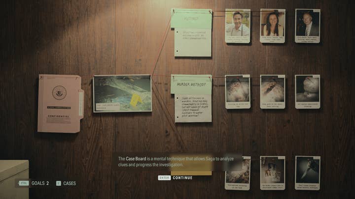
"These spaces contain what we call modules; the case board for Saga and plot board for Alan are such modules. They also include elements more traditionally found in menus, such as maps and collectibles," Wasselin said. "They have to share enough common elements that the player doesn't have to learn how to play the game twice. Some elements are present in both spaces, while some are each other's counterparts."
"We built an entire space for what could have been a menu, but it's important that players can influence the space and see their work reflected back at them"
Molly Maloney, Remedy
The term for these similarities in design is commonality. Using commonality, Remedy could teach the player a mechanic once and then use it in both parts of the stor; another example of this is the items in the safe rooms, which work the same way for both characters.
Additionally, the team used a principle from UX design called skeuomorphism to reduce the mental load on the player by having some elements function and feel the way they would in the real world. The vinyl player plays music from the game, you can find maps you collected in-game stuck to surfaces in the mind place, and you can exit through the door.
"We're aware we built an entire space for what could have been a menu," Maloney said, "But for player investment it's important that players can interact with and influence the space and see their work reflected back at them."

For Saga's gameplay, Maloney highlighted three elements that all influence each other and feed into the case board in the mind place.
"We wanted to give players the fantasy of being an FBI agent with an emphasis on exploration and puzzle solving," she said. "Basically, we dissected the fantasy of what an FBI agent is into a series of actions that our players could actually do: gameplay conversations, exploration and profiling."
The case board, inspired by HBO show True Detective, originally featured free placement of clues and gated progress until players found a specific answer, but this led to high player frustration. Remedy shifted to a board that featured more questions with easier answers, leading to more dopamine hits with players, and finally scrapped free clue placement to avoid clutter.
"Instead of an active component, it became reactive to what players were doing in-game and helped them understand the story better," Maloney said. "In short, it became a journal."
Maloney once again stressed the fact that players can engage with clues themselves instead of just collecting them in a menu, making something passive active, makes the crucial difference.
"Why make players watch when they can do? We shouldn't rely on narrative bookending to tell the story"
Simon Wasselin, Remedy
"Low expression puzzle mechanic versus really high expression journal mechanic," she said. "What's better, a journal you can write, or a journal you can read? By largely letting go of the puzzle component and the free clue placement, we made the board the best version of what the game needed it to be, instead of a mediocre version of something we couldn't let go of. A simple action is still better than no action, and letting the player place it helps with information retention, too."
Meanwhile, giving players the opportunity to miss non-crucial clues heightens their motivation to find everything and further shows that they have an impact on the board.
The profiling mechanic is what Maloney called "a fancier version of regular gameplay conversations". Essentially, Remedy wanted to find a way to let players talk to NPCs again without the need to backtrack to get the information they needed.
"We have a lot of exposition in this game and we didn't want the player locked into these increasingly repetitive gameplay conversations," Maloney explained. "We needed more varied ways to relay exposition; also, it's fun to grill and interrogate people."
In the finished version, Saga sits at her profiling table and receives something akin to unsettling visions in which NPCs answer important questions. The investment building here is in the flair these profiling conversations have, thanks to eerie writing and lightly spooky sound and visual design.
"In this case, a change in presentation can create the needed impact, and in my opinion, this is a very nice example of how it takes a village, when design, art audio and writing all work together you can make something unique and cool, even with the things you already have," Maloney said.

Meanwhile, Alan is metaphorically in two places at once – he is both the writer and the star of his own story. Again, Remedy broke down the fantasy of being a writer, ending up with the elements of finding inspiration, mapping out the story by using that inspiration, and exploring the results. All these elements needed to be expressed in his gameplay portions of the game.
"Finding inspiration was quite tricky to turn into a gameplay mechanic," Wasselin said. "We tried things like actively collecting symbols in the world to just passively exploring an area. We also thought about using Saga's mechanic of finding clues in the world. This was still too complex, and we needed to leave room for other gameplay mechanics like the puzzles using light."
Wasselin and his team settled on the echo scenes, which are cutscenes that you trigger in the in-game environment. They represent Alan looking at things from a specific angle to find inspiration. Because they take place in the environment, there's the risk that the player might simply move on without watching the scene, so a strong audiovisual presentation was key.
Players don't have a lot of agency over echo scenes – they essentially just trigger and watch a scene – but again the trick is to have players do something, rather than having them passively watch. The fact that players also need to solve the echo scene puzzle, although it's relatively simple in nature, causes friction by not instantly giving them access to what they need, and rewards them for the effort. Wasselin cautioned that the balance between rewarding and frustrating kinds of friction can be difficult to get right, but stressed the payoff is worth it.
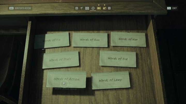
The gameplay mechanic for mapping out the story started as something quite similar as Saga's case board but was rejected by testers. Some similarities still exist; Alan has a board that he sticks plot elements to, for example, represented by single sentences or words. By combining these plot snippets with pictures, players can change a scene, transporting Alan to a different in-game environment. These scene changes are impressive and, as Wasselin admitted, expensive to produce.

"By limiting where and what you could impact, we could make it work without overblowing our budget," he said. "Scenes became specific locations that you could impact, choice would be represented by plot elements that you could impact through echo scenes. We needed to bend our own rules – wanting the plot board to mirror the case board so badly made it difficult to design."
"A simple action is still better than no action, and letting the player place it helps with information retention, too"
Molly Maloney, Remedy
Just like with Saga's case board, the team decided to forego some of the realism they were so fond of in order to design something that would be more satisfying to use. In the final version, players can find several words that change specific locations, and even if they don't find the right answer by deduction, they can try all possible scenes out and find the right one to progress by trial and error – something Wasselin said is incidentally very similar to the creative writing process.
"Wrong answers can be fun as long as you keep the wrong answer interesting enough that there is still some value for the player," Wasselin said. "Letting the player experiment is a great way to give agency, and allowing the player to find the right answer by themselves gives them a sense of ownership over the solution. It also creates more opportunities for visuals, resources, enemies, or narrative content, if the budget allows."
While there are more tools that Wasselin and Maloney couldn't cover as part of their talk, their main advice was to let the player take actions whenever possible and to not be afraid to let them work for the solution. Good presentation can elevate even simple mechanics, and if players work for information and are presented with ways to lighten their mental load, they can retain that information more easily.
"Your game may have different needs than our game had," Maloney concluded. "But if you understand the story you are telling you will find the things that work for you. It can be very easy to throw your hands up and say 'it is what it is, the story can't change', but while we can't always ensure player agency, ownership and investment can be built through expression."


