Five steps to boost your game's performance on the app stores
SplitMetrics' Lina Danilchik details how to optimise your app store's product page
Mobile games experienced substantial growth in 2020, with smartphones becoming even more essential devices for communication, entertainment, and even work during the COVID-19 pandemic and lockdowns.
According to GameAnalytics, the number of mobile gamers increased by 46% per month, while playtime grew more than 60%, since January 2020.
This growth in mobile gaming during the pandemic has opened up new opportunities for mobile publishers. At the same time, the competition is also getting tougher and mobile marketers are focusing more on boosting games' performance in the app stores. The secret to success lies in optimizing your app store's product page and getting the most of each element.
In the first place, optimize your icon, screenshots and app previews, as they give the biggest conversion uplift.
The table below presents data on the maximum conversion rate (CVR) uplift that can be achieved by optimizing icon, screenshots and video previews on the App Store and Google Play:
| App Page Element | App Store CVR uplift | Google Play CVR uplift |
|---|---|---|
| Icon | 22.8% | 20.2% |
| Screenshot | 21.7% | 24.3% |
| Video preview | 16.6% | 17.4% |
You may find more information about other important app store elements in the ASO Benchmarks & Trends Report for Mobile Games by SplitMetrics.
With the IDFA deprecation we are facing, optimizing your creatives is becoming one of the few ways to streamline both app store optimization and user acquisition efforts.
Step 1: Optimize your game's icon
- Visual salience
First of all, rely on the pillars of visual salience: color, orientation and size.
Let's define this term: visual salience is "the distinct subjective perceptual quality which makes some items stand out from their neighbors and immediately grab our attention," as explained on Scholarpedia.
People's attention is selective, and the human brain distinguishes objects in sharp contrast to the other things surrounding them. So attention of users in the app stores is also selective and attracted to visually salient stimuli.
- Color: сhoose colors that will contrast with what your competitors offer, attract users' attention and make them choose your game.
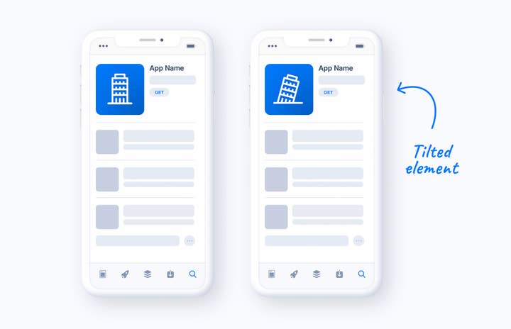
- Orientation: place tilted elements on your icon.
- Size: resort to size disparity -- place an object of a different size among objects of the same size to attract the attention of users, as size disparity is another salient stimuli.
You should always avoid details that are too small on your icon.
- Add your brand name to your icon
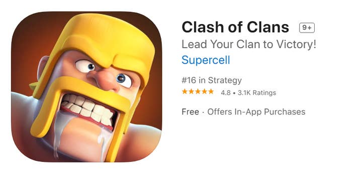
SplitMetrics experiments show that in case your brand is already well-known among your target audience, adding it to the icon will provide your mobile game with more credibility, enable faster brand recognition, and more users will download it without hesitation.
But what if you're still working on brand awareness? Well, my advice is still the same. Put your brand name on your game's icon, and users will memorize it faster. This is especially effective for mobile game publishers with multiple titles: users who already play some of your games will quickly recognize your brand name or logo on another game's icon, and will be more willing to install it.
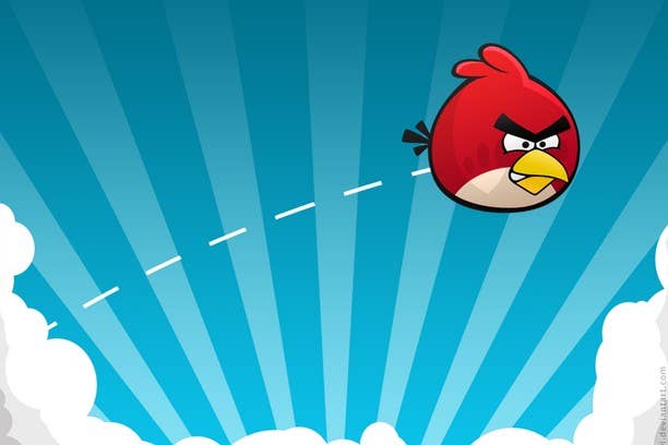
For casual games, engage users with your icon, make them mentally interact with your game when they see the icon for the first time. For example, if there is a fishing game, add a hand with a fishing rod to the icon. This will work for screenshots as well.
For role-playing games, put a character with an angry facial expression or solving an urgent problem on the icon.
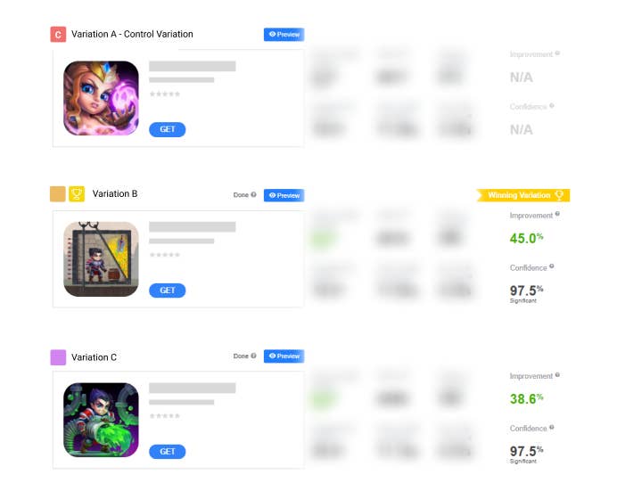
SplitMetrics A/B testing experiments show that icons depicting characters with angry faces bring an up to 30% uplift in conversion. Icons with characters solving an urgent problem show a 38-45% conversion uplift.
But before changing your icon or any other app store element, check that some of the described tips work for your game with the help of an app store A/B testing platform. As you strive to boost your game's performance on the app stores, you should make data-driven decisions only. So run mobile A/B testing experiments just to make sure you're moving in the right direction.
Step 2: Optimize screenshots or app previews
Again, resort to visual salience when it comes to optimizing your screenshots.
- Use contrasting colors for your screenshots.
- Highlight important elements and calls to action on the screenshots. You may also design screenshots that showcase the most important features of your game or innovations that are coming soon.
- Place tilted elements on your game's screenshots.
- Put objects of different size on the screenshots.
- Place characters looking or pointing at your game features or have calls to action written on the screenshots.
Experiments show that adding characters pointing at the "Get" button to the screenshots on the App Store helps to improve the conversion rate.
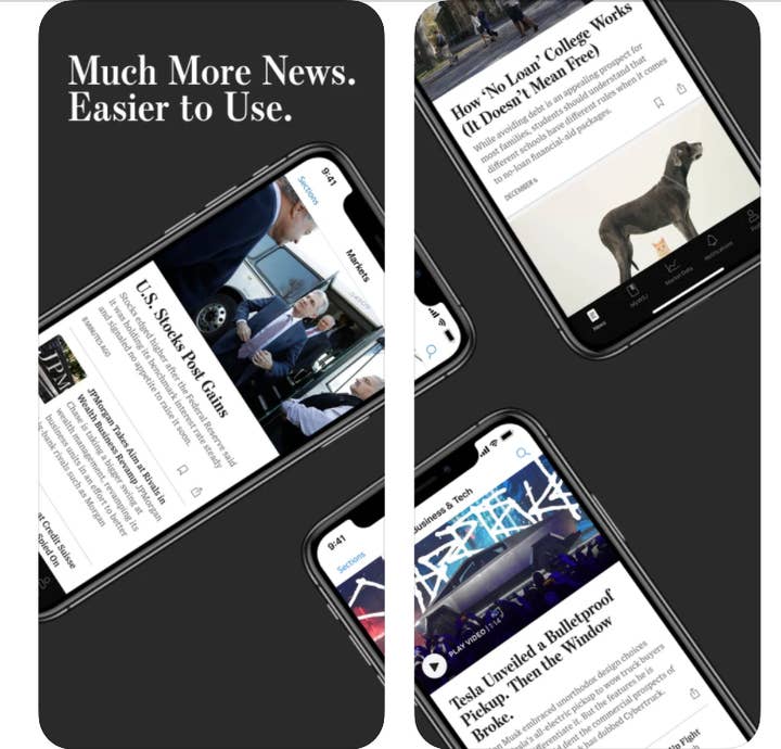
As is the case with icons, for role-playing games, showcase characters with angry expressions on the screenshots to draw user attention and get conversions.
This tip also works for strategy mobile games and may bring a 30% increase in conversion on average.
- Run A/B tests
A/B testing experiments on SplitMetrics revealed that strategy game players turn their devices horizontally when playing, so opt for landscape screenshots which show good performance for this mobile game category.
Even if your game doesn't belong to this category, try adding a landscape screenshot instead of or along with the portrait ones. Landscape screenshots tend to catch user attention on the search page, while portrait visuals show higher conversion rates on product pages. But first you should always run A/B tests.
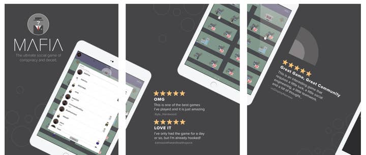
- Showcase social features and user reviews on the screenshots
Because of the pandemic and lockdowns, communication has become more important than ever. So users appreciate social features in mobile games, such as chats, leaderboards, PVP mode, social media integration, live streams, etc.
SplitMetrics experiments reveal that reviews placed on screenshots might significantly boost the conversion rate of a game on the App Store or Google Play. One of the tests showed that, in an app preview, photos of players next to their reviews increased conversion by 19% compared to the same video without any reviews. The same works for game screenshots.
Step 3: Creating the perfect title and description
Finding the right title, subtitle and description texts is key, and optimizing those will boost your game's performance. Here are some tips.
- Add a short description to your game's brand name
According to our experiments, the combination of a brand name and app or game description in titles in the app store increases the conversion rate. Even big publishers, such as Google or YouTube, take advantage of this tip. So try adding a key feature of your game next to your game's name and see if it works for you. App titles in the format "brand name + short game description" show stable good performance, high tap-through rate, and conversion rate.

- Title length
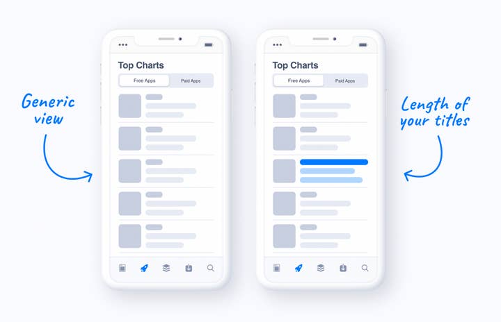
You should adjust the length of your titles and subtitles based on the titles of your competitors
This tip also refers to visual salience: most users will unconsciously pay attention to your game in case its title and subtitle's length differs from what your competitors have. Most titles of games in your category are short? Do exactly the opposite: replace your game's title with a longer one. In such a case don't forget about the previous tip I've shared above: include the brand name and short description of your game to the title.
Step 4: Localize your game for target markets
Your game's page should be localised in the App Store and Google Play Store. Players from various countries have not only languages that differ, but also cultural specificities and different mentality. Today, cultural sensitivity is crucial if you're entering new markets.
So you need to approach your game with culturalisation in mind and not only localisation: adjust your creatives in addition to just translating subtitle, descriptions and text on screenshots. That might help you achieve the desired results and improve your game's performance. If in doubt, you should do some A/B tests.
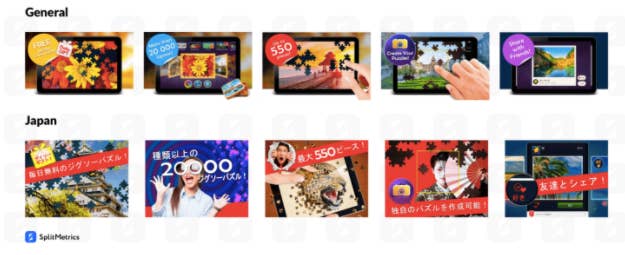
For example, mobile games developer Zimad optimized the product page of their game Magic Jigsaw Puzzles for Japan and got a 36% conversion rate uplift.
The Zimad team carried out research and analyzed the leading Japanese apps to identify some patterns of the Japanese style. They discovered that publishers in Japan tend to utilize a lot of small elements on their app store screenshots, add emotional captures and various visual effects to them, which goes in contrast to screenshot design trends in Western markets. So they added more Japanese cultural elements to the screenshots, and it worked.
Step 5: Adjust your game creatives to holidays
Festive season is another opportunity to attract new players and drive more conversions in the app stores. Optimizing app store visuals for Christmas, Halloween and other holidays or high-profile events is a must for all game publishers that want to stay abreast of the competition.
Create a sense of urgency -- add calls to action urging users to download your game to the screenshots and get some new holiday-related features within a limited time frame. This tip is based on loss aversion, a theory that we fear loss much more than we desire gaining something. So users will be afraid of missing an opportunity to play the Christmas version of your game, and will be more inclined to install it.
Lina Danilchik is a marketing manager and app growth evangelist at SplitMetrics. She provides mobile publishers with tips on mobile app and game growth, app store optimization and user acquisition. Danilchik is also the host of App Growth Talks, a series of interviews with mobile growth experts worldwide.