How Astroneer creates an enjoyably unsafe space
Why I Love: Student game developer Aden Webb explores the mood-building design decisions of System Era's survival sandbox
Why I Love is a series of guest editorials on GamesIndustry.biz intended to showcase the ways in which game developers appreciate each other's work. This column was contributed by indie developer and game development student Aden Webb.
Astroneer isn't like many other games. It doesn't bombard the player with arbitrarily increasing numbers, but it communicates all the information you need just the same.
This falls in stark contrast to what might be seen as the norm when it comes to UI design and information presentation. It is only too common to see bars and meters smattered across the screen, damage values flashing up above your enemies' heads and combos stacking up in the centre of the screen demanding your attention and maintenance. While this can, in itself, build a complex and satisfying feeling of advancement, Astroneer takes a drastically opposed route to the same goal.
System Era has designed a satisfying experience which pivots on the lack of UI. Everything is there, waiting to be explored and when it is explored, it was you. You didn't follow a minimap or a quest objective. You walked.
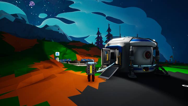
When you first load up the game, you will be tasked with choosing one of a selection of charming space-suited astroneers before jetting off to the nearest planet. When the dust settles around your new shelter you see, laid out before you, a planet. A beautiful brightly coloured world filled with alien plants, mountains, and storms.
But no civilisation. Despite the bright colours, the vastness of space is not lost and the world does make you feel alone. No comforting minimap, no health bar sitting happily at 100%.
This is a survival game, but it does not feature hunger or thirst - your primary meters are oxygen and power (represented on your backpack, we'll get to that later). While you are within range of your home - you are safe, they do not decrease. But you need resources, and to get the resources you need to stray away from the safety of your shelter. As soon as you are out of range your oxygen and power start to decrease. The start of the game consists of multiple mad dashes away from home to grab some of the core material components - resin and compound.
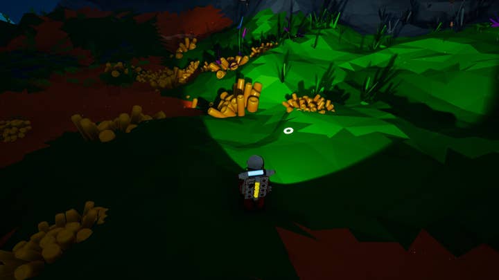
With these you can craft tethers, the backbone of exploration in Astroneer. Tethers allow you to extend the radius of safety around your home and make trails which you can follow to stray further and further away. As long as you are near a tether which is connected in a chain back home, you are safe.
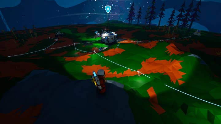
This has the important effect of naturally creating a web of previous journeys, branching off in every direction from your central hub. Even though the world is huge and expansive, you are limited to your own little safe spot - a tiny speck in the whole world. As your base grows with various machines and storage facilities so does the web of journeys.
One of the best feelings in this game is finding a big mountain near your home, travelling to the top and looking out over your progress -- a visual representation of your tale that is being woven into the world that you landed on. There is no list of objectives to be marked off; you make your own goals and their completion is evidenced in little pathways of glowing tethers.
This open and visual design philosophy extends far beyond the progression system. The game lacks any kind of heads-up display while you are exploring, there are no storage chest interfaces or an inventory that you have to open. Unnecessary pop up text windows have been removed and only retained where it is important to convey something that doesn't actually exist in the world like a button prompt.
Your character has a backpack which can hold a small number of resources. These resources are visible at all times and can be dragged to and from the backpack seamlessly. Also on this backpack are your energy and oxygen bars, preventing the need for any kind of health bar or ticking meters in the corner of your screen. Since these bars are purely in-game, you are never given a concrete value for your resources. Instead of 23%, you just have roughly a fifth of a bar. Will it get you home?
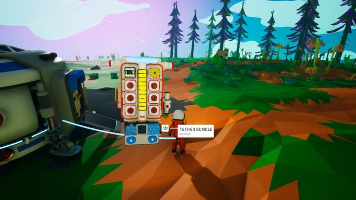
(The research screen is also available as a pull-out tablet and my favourite of all is that buttons with irreversible ramifications have a small flip up cover instead of a screen which says "Are you sure you want to do this?".)
The game itself feels vast in a way few other sci-fi exploration titles have managed, with interesting geography (only enhanced by the new terrain generation) and sprawling cave systems filled with strange plants and new materials. On the surface you can find a huge variety of wrecked bases and spacecraft. When playing solo, this gives the game almost a lone survivor feeling where you can scavenge the ruins for new tech that's ahead of your current knowledge.
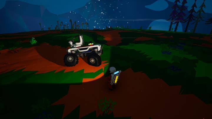
Visually, Astroneer is beautiful, simple colours and charming character animation lead to an easy-to-follow experience. In multiplayer, the character animations are shown off even more, with each suit having a different walking style and emotes serving their purpose of communicating with teammates even if voice chat isn't an option.
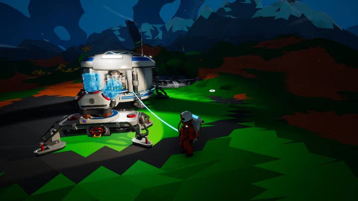
The very high animation quality extends to the base machinery as well - every process feels incredibly tactile and all the machines are constructed in such a way that their internal workings are very much exposed. There is not one occasion where your material is taken into a box and pops out the other side having been processed. You always get to see it being deconstructed, moved around or combined in a fun way. The machines feel like you imagine science to be as a child - all moving parts and turning wheels and finally spitting out your result at the end with a puff of smoke.
A game like Astroneer needs a soundtrack that encapsulates its atmosphere without being intrusive. Luckily the OST composed by Rutger Zuydervelt does just that and provides a perfect backdrop for your brightly coloured adventures.
System Era has created a vast, relaxing experience that captures what I thought going to space would be like as a child. It is a game which should be considered exemplary in immersive design and UI-light interaction.
It pokes and prods you in roughly the right direction just enough so you are forced to explore the world yourself, not relying on markers or quest objectives. You move through necessity and through curiosity, and in time, a thriving settlement is waiting for you.
Developers interested in contributing their own Why I Love column are encouraged to reach out to us at news@gamesindustry.biz.
