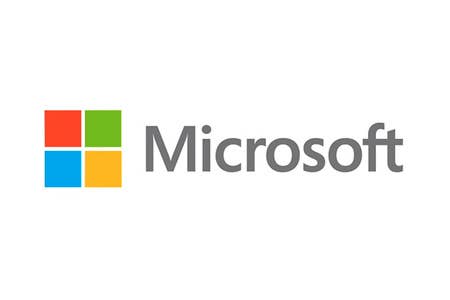
Microsoft updates 25 year old logo
The company makes a change just in time for Windows 8
In a post on the Official Microsoft Blog, the company revealed a brand-new logo for the launch of its new ecosystem. The Microsoft logo has been the same since 1987, so the change is a marked one for the company, which looks to launch Windows 8, Windows Phone 8, a new version Office, and more this year. Most of the company's new product line has already seen updated branding as shown in the video here.
The new logo is in the Segoe font that Microsoft has been using across several products for the last few years.
"It's been 25 years since we've updated the Microsoft logo and now is the perfect time for a change. This is an incredibly exciting year for Microsoft as we prepare to release new versions of nearly all of our products," wrote Microsoft general manager of brand strategy Jeff Hansen in the post.
"The symbol is important in a world of digital motion (as demonstrated in the video above.) The symbol's squares of color are intended to express the company's diverse portfolio of products. We're excited about the new logo, but more importantly about this new era in which we're reimagining how our products can help people and businesses throughout the world realize their full potential."
Microsoft has already updated the logo on Microsoft.com and will be updating it across all Microsoft stores in the next few months.

