Critical Consensus: Surface
Microsoft's first non-console hardware and entry into the tablet market is a success, but only on the surface
The Surface is a significant device. There are many differences in opinion and numerical scoring among reviews of Microsoft's virgin attempt at PC hardware, but that's the one thing on which every critic agrees. A multitude of Android tablets has done little to weaken Apple's dominance in the market, and the imminent launch of the iPad Mini seems likely to solidify its position, but the Surface promises a new experience in more than just form factor.
It is a tablet for productivity, with full-featured apps based on Microsoft's Office suite, and a range of robust and smartly designed keyboards. It's a tablet for getting things done.
"If it ran Android, people might well conclude that it was the best Android tablet on the market"
Harry McCracken, Time Magazine
For The Wall Street Journal's Walt Mossberg, the hardware's first iteration has largely succeeded in its most prominent goal. Indeed, he open his review with a reminder that the very paragraph you are reading was typed and posted in a coffee shop, using the Surface.
"Microsoft has given the tablet the ability to behave like a familiar Windows PC, at least in some scenarios," he says. "It comes with full versions of standard Microsoft Word, Excel and PowerPoint. The three programs worked fine, in creating documents and in editing ones from older versions of the software.
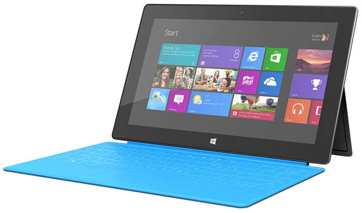
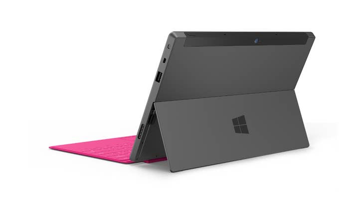
"Microsoft has designed two clever, very thin, optional keyboards that snap on magnetically and double as covers. These are better than any of the add-on keyboards I've seen for the iPad. And Microsoft has built in a standard USB port and a sturdy kickstand for typing on a desk... These features make the Surface better for traditional productivity tasks than any tablet I've tested."

With Apple engaged in what seems like dozens of patent lawsuits all over the world, the importance of distinguishing a competing tablet from the iPad could not be more apparent. To a large extent, Microsoft has achieved this with the Surface, learning only from Apple's attention to design rather than mimicking the appearance of its products. Time Magazine's Harry McCracken is particularly impressed by how fully Microsoft has delivered in this area, calling the Surface "a beautiful piece of work" that is as aesthetically pleasing as an iPad despite making numerous original, "un-Apple-like" design choices.
The magnesium case is "good-looking" and "sturdy," allowing the Surface to house a considerably larger screen (10.6" versus the iPad's 9.7") without dramatically increasing its weight. Somewhat inevitably, that larger screen isn't as eye-wateringly sharp as the current iPad's retina-display, but the relatively minor gulf in visual fidelity does little to distract from the level of quality Microsoft has reached in the first iteration of the Surface hardware.
"Windows RT is delightfully gesture-friendly, and Microsoft has clearly spent much time thinking about and creating an entirely new interface"
Matthew Honan, Wired
"If it ran Android," McCracken writes, "people might well conclude that it was the best Android tablet on the market."
But it doesn't run Android; it runs Windows RT, a version of Windows 8 specifically optimised for tablets that represents a bold new direction for what has long been the core of Microsoft's business. However, while there are certain similarities between RT and Windows 8, and there is a more expensive Surface with Windows 8 due next year, Wired's Matthew Honan emphatically states that this version of the hardware, "is not a Windows 8 machine" - though even Microsoft seems to be confused on that matter.
"Which makes it curious that there is a Desktop mode at all," Honan states. "What is it there for? There are a handful of system applications and a suite of Office apps. But otherwise it seems like it's just going to cause confusion. The old Windows desktop is a very odd interface element on this device. I think Microsoft should have cleanly pulled the band-aid off and ditched the desktop metaphor altogether. Leave that for desktop computers.
"But in terms of interface elements, Windows RT works much like Windows 8. It is delightfully gesture-friendly, and Microsoft has clearly spent much time thinking about and creating an entirely new interface. Swapping between apps by swiping onto the screen from the left side, using semantic zoom to pinch and zoom out on all your on-screen elements, and the ability to kill running apps by dragging down from the top of the screen are all gestures I miss tremendously when using other devices. I have even found myself absent-mindedly trying to use them on other operating systems. And that's great. It means they work."

The Verge's Josh Topolsky is also impressed by Windows RT, which is fortunate, because in his view the Surface is, "defined by its operating system." Like Honan, Topolsky is puzzled by the inclusion of a desktop environment that seems to exist only to support five applications: Word, Excel, PowerPoint, OneNote and Internet Explorer. When Microsoft has "expressly forbidden" third-party developers from creating apps for the Surface's "windowed, desktop environment," it seems odd that the Office suite wasn't just modified for the new touch-and-tile interface.
"I believe Microsoft could have wrapped all of this functionality in a cleaner and more user-friendly interface, thus keeping the user from shifting between two extremes," Topolsky writes. "Why the company chose to go the route it went is a mystery perhaps only Steve Ballmer himself could unravel.
"The actual interface - the tiled environment - is a joy to use. It's really, really cool. I found myself legitimately delighted by some of its functionality, particularly its multitasking and side-by-side apps concept."
"How is it possible that in launching a massively important device like this, Microsoft couldn't muster up a single killer game title to pull in the Xbox fanbase? Halo: Surface Edition, anyone?"
Josh Topolsky, The Verge
Trite statements are the enemy of a good review. If the critical evaluation of products is a key part of your day-to-day work, the ultimate goal is to make astute observations that have eluded your peers. With the Surface, however, the most significant problem - besides some bugs in many of the apps that are being steadily ironed out - appears in every single review, very often in the headline. Despite Microsoft's best effort to create hardware that stands apart from the competition and an OS that feels both personal and uniquely suited to the tablet form-factor, it cannot replicate the vast ecosystem of content that Apple has gathered after years of constant iteration on the iPhone and iPad hardware.
Is it reasonable to expect the Surface to compete with the latest iPad's performance and range of apps before it is even available to the public? Perhaps not, bit there's no avoiding how significant these factors will be when it comes to a consumer choosing between one tablet and another. The Surface may have solved these problems in three years time, but where will the iPad be at that point, or the Google Nexus 7, for that matter?
For Topolsky, the Surface's good points don't prevent it from being at a significant disadvantage right out of the gate, and he is left wondering if Microsoft could have done more.
"How is it possible that in launching a massively important device like this, Microsoft couldn't muster up a single killer game title to pull in the Xbox fanbase? Halo: Surface Edition, anyone?
"The whole thing is honestly perplexing. If this device is not as good as (or better than) the best tablet, and not a complete alternative to a laptop - who is this for? What is it supposed to be?
"There may be a time in the future when all the bugs have been fixed, the third-party app support has arrived, and some very smart engineers in Redmond have ironed out the physical kinks in this type of product which prevent it from being all that it can be. But that time isn't right now - and unfortunately for Microsoft, the clock is ticking."

