Flights of Fancy
Spaceships in video games don't have to look like Star Wars or Star Trek; a look at the ships in The Expanse offers some lessons in originality
Imagine a spaceship. Go ahead, picture it.
A tenner says I can guess what it looks like.
Modern sci-fi games have a problem, and that problem is that they all look the same. You have planets, you have starfields, and, of course, you have spaceships. And despite the best efforts of hundreds of extremely talented people, all those spaceships display a certain sameness.
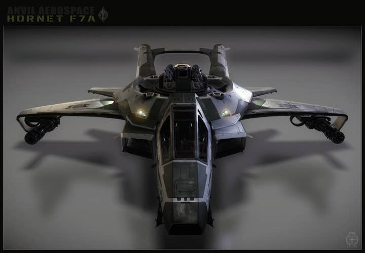
The Hornet F7A, from Chris Roberts' Star Citizen, is a perfect example of this. It's a nice design - it is, says Chris Smith, the game's lead spaceship artist, "one of the main iconic ships in the game". Looking something like a cross between an F-15 and a Challenger tank, its militaristic brutality is offset by elegant in-curling winglets, and its chunky central gun turret does no harm to its sleek profile. It looks fast and deadly. It would fit neatly into StarCraft, Halo, or James Cameron's Avatar.
How can designers break out of this paradigm?

SyFy's tense interplanetary drama, The Expanse, has drawn numerous plaudits for its design and world-building. In particular, its realistic approach to space travel differentiates it strikingly from comparable series, such as Star Trek and Battlestar Galactica. It shows a gritty Solar System in which life in low gravity makes return to Earth impossible for asteroid miners, irradiation and oxygen depletion are constant, crippling hazards, and getting anywhere fast calls for grisly injections of acceleration-resistance drugs. As a result of this approach, the ships its characters travel and live in look quite different from the norm.
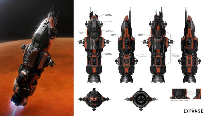
"What's cool about it is that it was an opportunity to do something different to what's normally done, because it's based on the physics of the thrust from the drives," says Ryan Dening, one half of North Front Studio, the Toronto team that designed the series' ships. "We were designing things almost like rockets or buildings, vertical things, [as opposed to] horizontal battleships."
"I think it's good to be aware of what the trends are in concept art, and the look of things, but I think it's a good idea to try to push yourself out of that"
The Expanse's Ryan Dening
This also meant that when the ships decelerate, they flip around and approach their destination engine-first. "Everything about the drive is so important because it's what provides their gravity, but also, there's a shot in the first season where [hostile ships] are flying in and decelerating, and they're looking at the [engine] cones of these ships before they even see what the ships are... I just thought of it as really cool because it was different."
But the show's unusual design requirements came in more subtle forms, too. "Generally the engines are cones, on most of the ships," says Dening, "so you have a tie to present-day rockets - versus oddly-shaped thrust vents that you might get in something like Star Wars or Star Trek." The ships are windowless, and combat is shown as taking place at long range. "You have a lot of torpedoes that would fire, and then all the ships have these point defence cannons that can target and track [them]... So I think the way they do the battles is quite different from what you're used to seeing."
What's the take-away here? It's not 'Make ships that look like The Expanse's ships'. It's not even 'Vertical ships are fun'. It's that by changing the constraints of the backstory, and designing ships to fit that, you can come up with distinctive ships that have a genuinely unique look.
"I think what's cool about both of those constraints [the verticality and the windowlessness] is that it made it easier for us as concept artists to work with the production designer and come up with something that felt less like Star Wars or Star Trek," says Dening. "It has its own look, and I would say that a lot of that's just because of paying attention to the fiction... It's not just about making a cool-looking ship, or 'What's our ship style? What's our thing?' but starting with 'How do the ship designs reflect the tone of the source material?'... I think it's good to be aware of what the trends are in concept art, and the look of things, but I think it's a good idea to try to push yourself out of that."

This isn't, Dening is at pains to point out, something games don't already do to some extent. The Mass Effect series, for example, has a well-thought-out system of interstellar travel that shapes both its ships and the universe they fly through. But the overall effect is to replicate the standard space-opera conventions: uniform artificial gravity, horizontal ships in the shape of futuristic aeroplanes, and interiors so insulated from acceleration and deceleration that crates and boxes can be left lying around unsecured. The stand-out points of its visual design come instead from virtuoso playing of the conventional instruments: "They set the basic line 'We're going to do Syd Mead ships'," he says, "and they really did it, and it has its look, and it's cool."
"If you look at the profile of the [player's ship] Tempest," says Joel MacMillan, art director on Mass Effect: Andromeda, "you do get that really cool cantilever balance to it, where its landing gear and the struts are all at the back of the ship, and you just have this very long, elongated fuselage and nose that extends well out in front the ship - but if you look at it from another angle, if you look at it from the front, you get a W-shape, which seems new, it seems fresh; it's not at all what you imagine it looking like if you see it in profile. I liked the idea that, however you shoot these things in the cinematics - whether they're flying through space, or docked at a space station - you get these really cool opportunities to see it in a different light depending on what camera angle you shot it from. [...]
"The inertia, the physics, the gravity, and all that kind of thing... they found a way to explain that away for the Normandy, and we just inherited that same fiction"
Mass Effect's Joel MacMillan
"One of the approaches we did have - and this applies to the exterior as well as the interior - that, similar to the [original Mass Effect trilogy's flagship] Normandy, there's a certain elegance to some of the shape play and the line work, and so if you look at the Tempest, I really wanted to inherit that sex appeal that the Normandy had. And so the top is very elegant, it's very clean, sleek lines, it's a very high-gloss surface, so it would reflect the skybox, the stars, and any light source that it passes by. But beneath that, the lower half of the Tempest is all much more industrial-looking - it exhibits a bit more of a tactile nature. You see a lot of the pistons, you see a lot of the latches and the doors, and the panel lines. And that was a very conscious effort... because I feel that brings an element of believability."
MacMillan's eye is sound. But when asked about the design rationale behind the game's conventions, he falters. "The inertia, the physics, the gravity, and all that kind of thing... they found a way to explain that away for the Normandy, and we just inherited that same fiction. But a writer would be able to give you a very technical explanation for why we're able to do all of this without characters getting plastered against the back of the cockpit walls when they jump into FTL."
So what does it take to really break free from the standard model of starship design? The key word in MacMillan's answer is 'explain away': rather than having writers back-fill the setting to fit the kind of ships that come naturally to the designers' minds - i.e. conventional designs - designers, artists, and writers need to work together to produce worlds with conventions that break the mould. Starting from a different point of origin, the designs that emerge will necessarily speak their own design language.
Maybe everyone has to get around using conventional rockets - so ships need huge fuel tanks. Maybe the pilots are dolphins, because they are better at navigating 3D space. Maybe instead of a protective hull, ships can use force fields to protect their crew from the hostile conditions outside. Maybe ships need to spin to generate 'gravity' - or perhaps their gravity plates are double-sided. Unconventional decisions at the very first formative stages of the design process can allow a game's visuals to develop in unexpected directions, following their own internal logic. That logic, in turn, allows the audience to make sense of the world with which the game presents them - avoiding the sort of pointlessly confusing novelty-for-its-own-sake that crippled David Lynch's film of Dune.
To point this out, though, is not to claim that it's the one true way of designing spaceships for games. Despite its conventionality, Smith is happy with the Star Citizen approach. "There is quite a bit packed into it... A lot of it is based on our classic sense of sci-fi gameplay. We start there as a starting point. And from movies - we want a little bit of a movie experience when you play our game. And the rest comes into, 'Now how much time and money can we put into this idea? How feasible is it?'... Because if you want to add new systems, and modify the engine to add systems in some cases, it just takes more time and more resources."
This is the downside of gunning for novelty. Trying to break the mould brings with it additional design risk - both the risk that it will be costly to make work, and the risk that the look won't resonate with the game's intended audience. But if the reward is a game that stands out head and shoulders from the pack, that risk may be worth taking.
